ShopDreamUp AI ArtDreamUp
Deviation Actions


Description
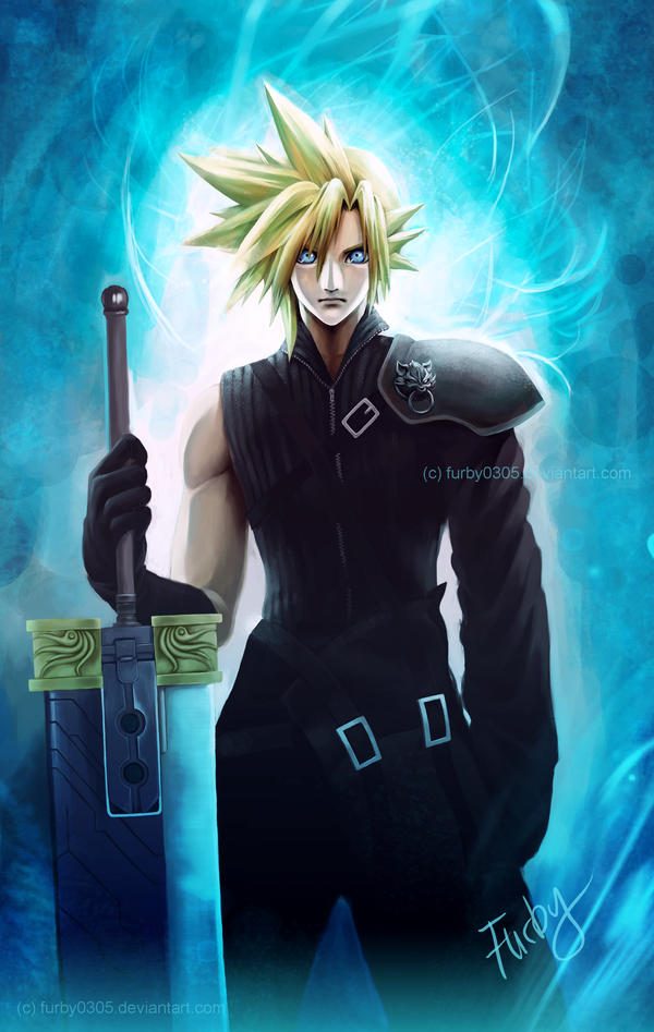
OMG this took me ages!!!
I hope you all like it So this picture is for the latest poll "Favourite Character from FFVII" - result was Cloud xD
Full view please (Wink)") Details here
Details here 
Done with Photoshop CS2
Cloud (c) square enix
Art (c) me
Please do not use without permission
See also Squall
I hope you all like it
Full view please
Done with Photoshop CS2
Cloud (c) square enix
Art (c) me
Please do not use without permission
See also Squall
Image size
1990x3140px 3.78 MB
© 2010 - 2024 LauraFurby
Comments191
Join the community to add your comment. Already a deviant? Log In
wow. this is truly breath-taking. I love it. I am a huge Cloud fan and I can see how much hard work, sweat and tears (jks jks) you've put into this piece. Your effort really shines through.
Now, my critique on this may be partially flawed because of the differences in style there are between artists so if it seems strange, that's an apology on my part.
The first thing that caught my eye was...well, the eyes. They're very big and while that's not always a bad thing, you do want to be careful about exagerations like that. Just something you might want to keep in mind for your next piece.
Another thing 'm pointing a finger at is the holes in the buster sword. The beackground behind should be consistant with the rest of the picture at it seems like it should be lighter in that area. It might make the sword stand out.
Finally, Cloud's shoulder pad is the last thing I will touch upon. It's a very akward piece (Lord knows how Cloud can manouver in that thing) and the lion's head seems out of place somehow. It can be very difficult to get this to look right. Perhaps a more open collar will allow you to move it down his shoulder and get the lion's head to be more centred.
Like I said, these things could just be style so this is just my opinion. Over all, a fantastic job.